


Laguna Ocean Foundation
I partnered with the nonprofit Laguna Ocean Foundation to deliver an improved website experience by analyzing user needs, designing flows, and creating visuals that support their mission of coastal preservation through discovery and education.
Overview
Over 10 weeks, we delivered a full website makeover that improved clarity, accessibility, and user engagement, managing design, development, and project coordination to create a cohesive experience.
TIMELINE: 10 weeks
TOOLS: Figma, React.js, Trello
PLATFORM: Mobile & Desktop
CLIENT: Nonprofit Stakeholder
TEAM: 6 students (Design/Developer)
MY ROLE: Lead Developer


A Website Makeover
Our group redesigned the Laguna Ocean Foundation website to solve issues with usability, accessibility, and outdated visuals.
Our approach was multifaceted, incorporating:
Through multiple design and agile development cycles, we created a responsive site that communicates the foundation’s mission.
The original website:
Wasn't optimized for mobile and desktop devices.
Had weak visual branding
Displayed a lack of clarity and calls to action
Our client needed:
A foundation that needed a site that would reflect their mission, attract donors/volunteers, and work across devices.


Project Scoping
Requirements
Requirements aligned with stakeholder priorities.

Workflow
I set up a Trello board to keep us organized using a Kanban layout to make sure stakeholder priorities didn’t get lost as we iteratively updated work.

"How might we redesign the Laguna Ocean Foundation’s website to better support user needs, increase accessibility, and foster deeper digital engagement with coastal preservation efforts?”
Problem Statement:
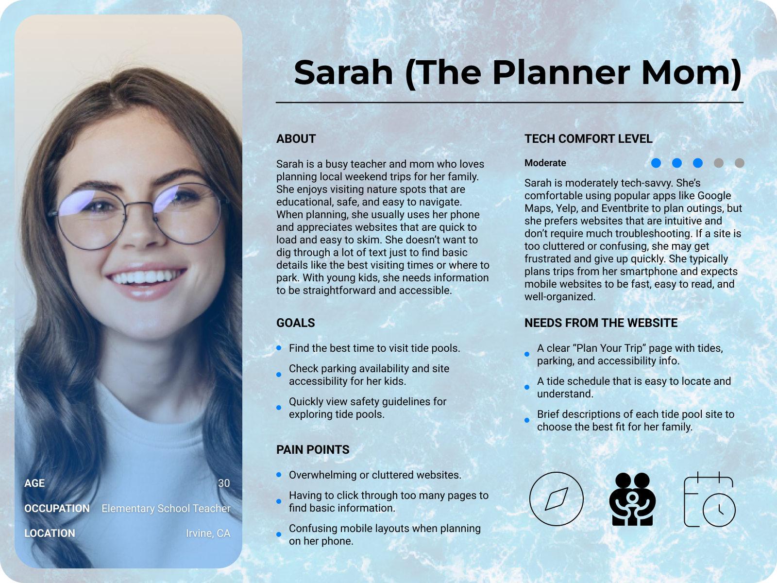
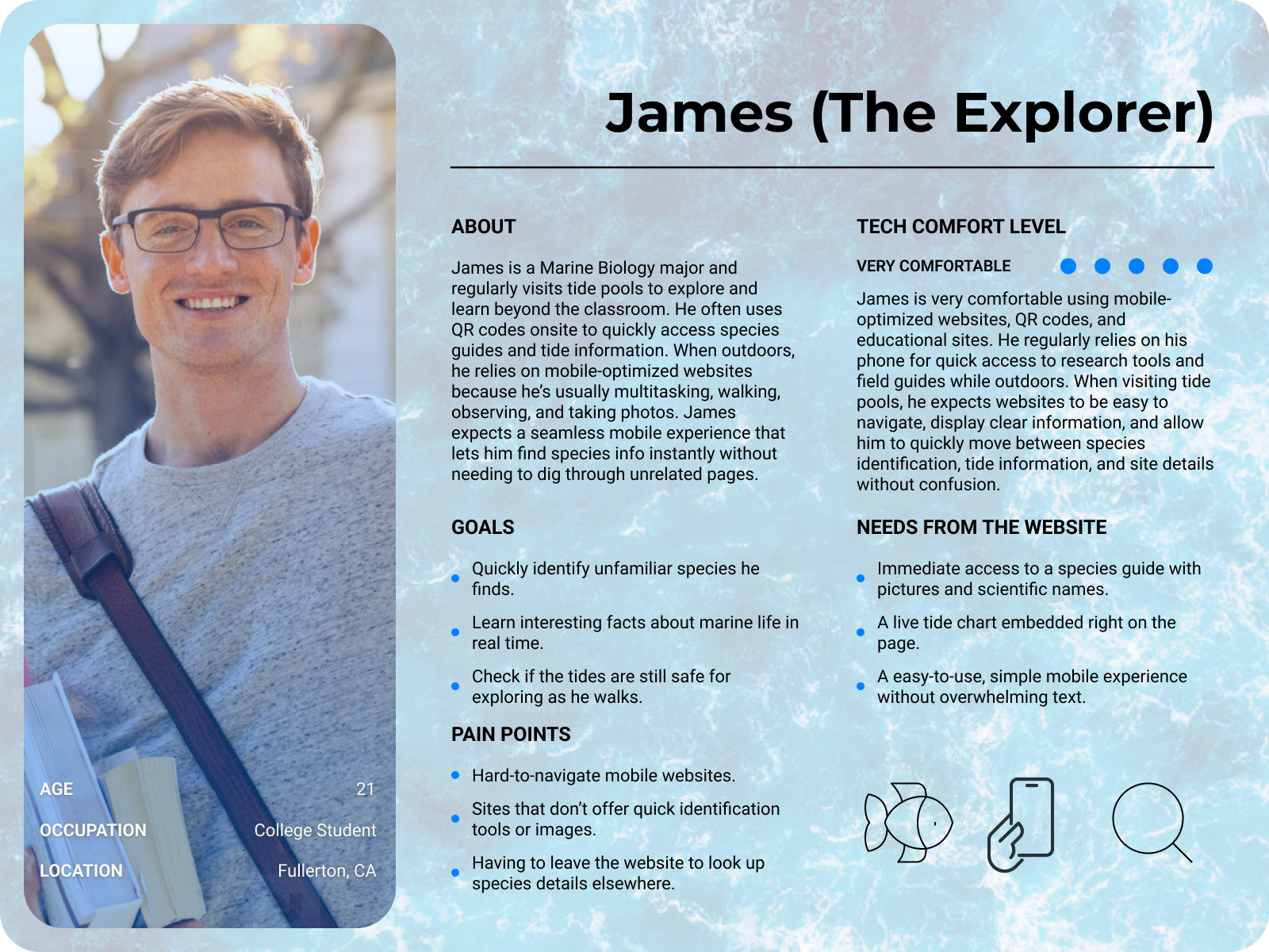
User Personas
Diagramming


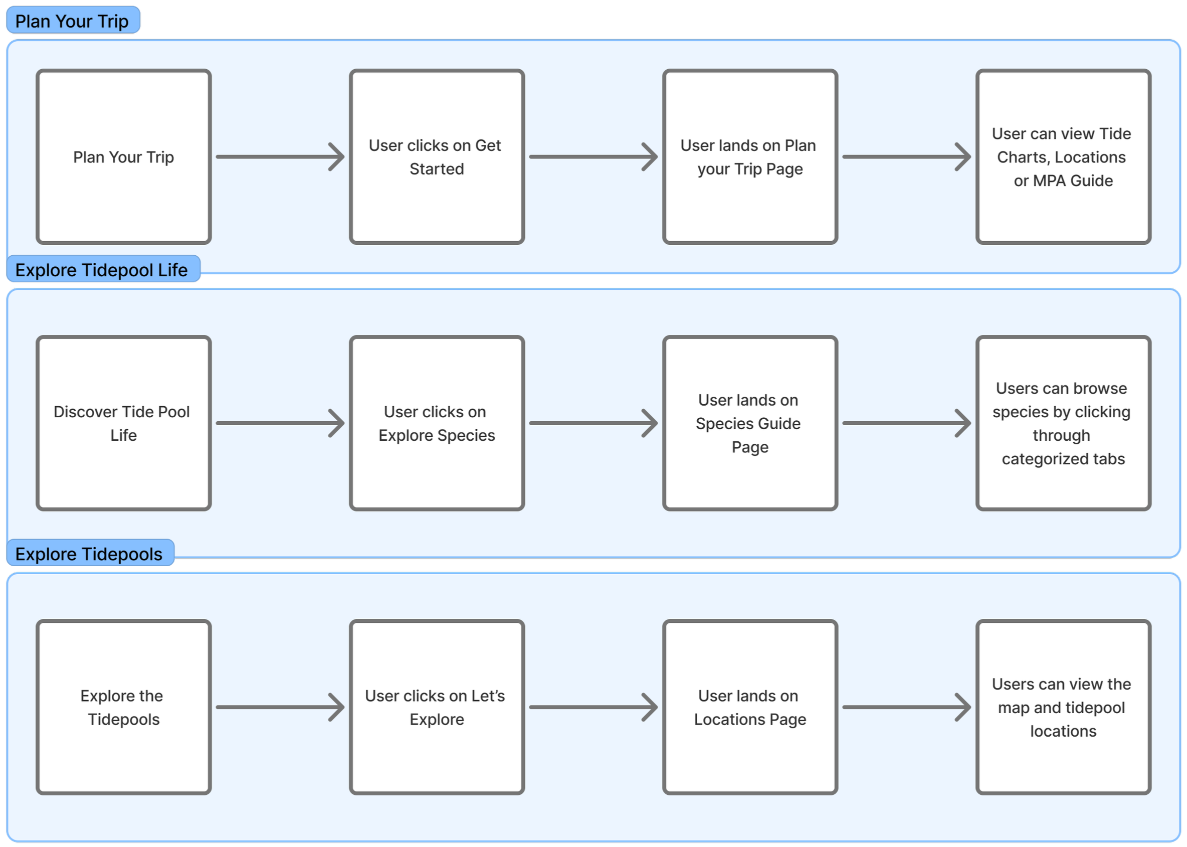
First, a UI flow shows core interactions, followed by a support copy diagram mapping the user journey across roles. Task flows then outline specific in-app actions.
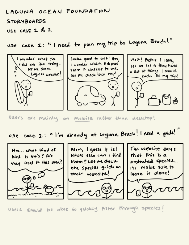
Sketches & Storyboards
Focusing on mobile-first, I used user stories, sketches, and wireframes to map core interactions, prioritizing essential content and guiding design decisions for a clearer, smoother user experience.
Storyboard
Low Fidelity
Wireframes
Visual Research


We explored a variety of zoo and wildlife websites to spot design patterns that could guide our approach. We noticed these sites tended to emphasize:
Clear, unobstructed photos to capture attention.
High-contrast, readable text to support accessibility for younger users.
Simple layouts with minimal distractions Interactive elements (like tabs or filters) to organize information intuitively.
Key Design Decisions
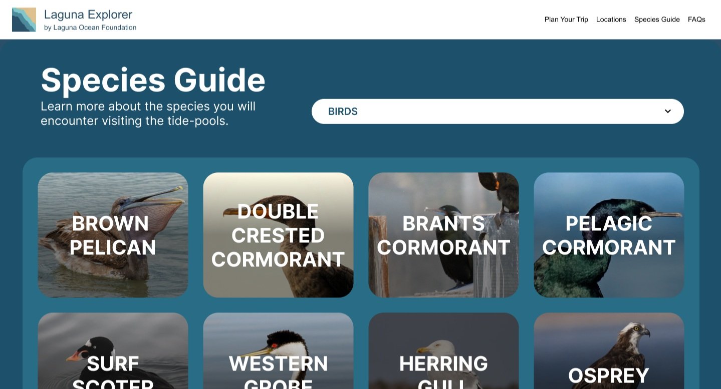
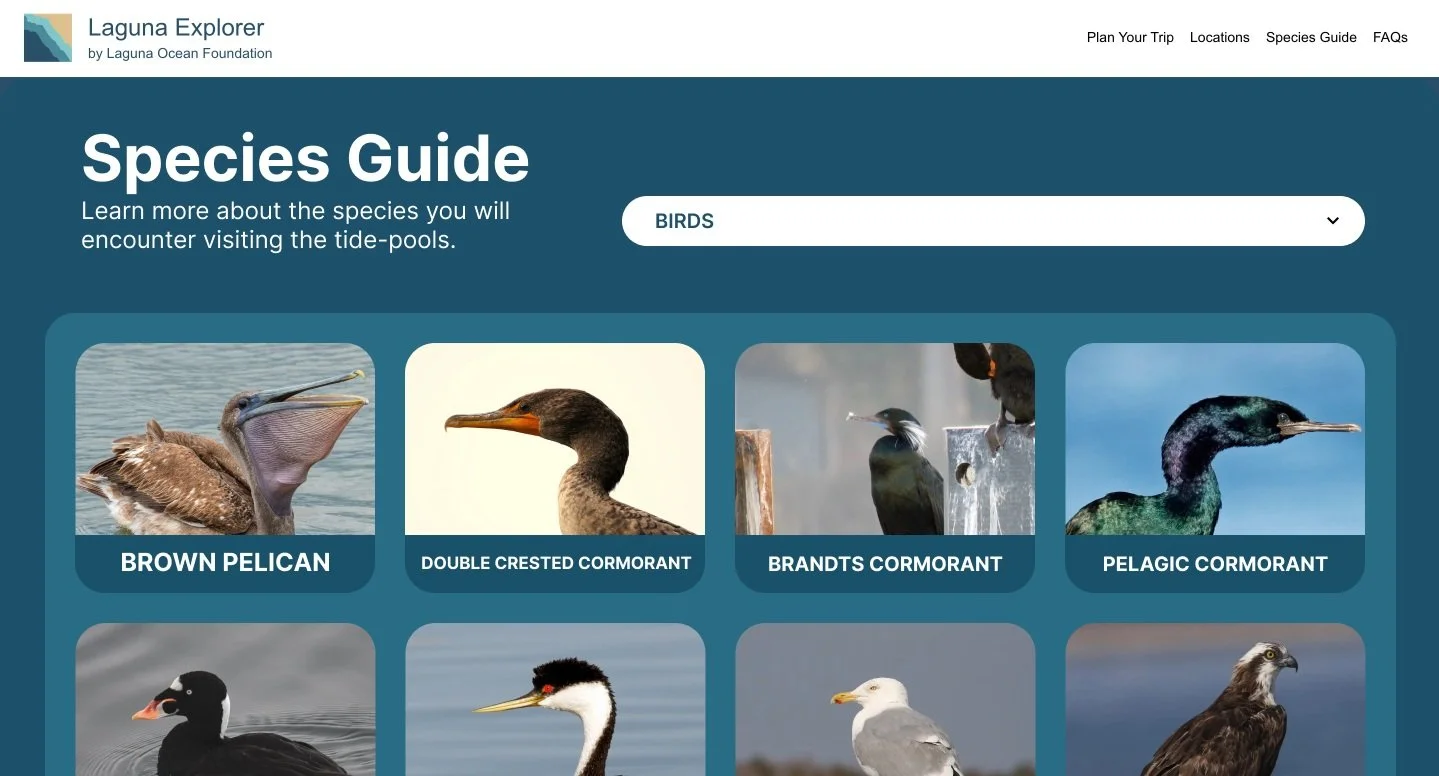
Species Guide Layout
We explored two layout options for the species guide: one that emphasized elegance and visual refinement, and another that prioritized clarity and ease of reading. We chose the latter for its better accessibility and ability to accommodate the varied colors, textures, and compositions of the photos.
Interactive Map Integration


The original site’s location info was fragmented and hard to navigate.
By choosing to centralize everything into one map-based experience with collapsible cards, we made it faster for mobile users planning visits while they’re on the go!
Universal Redesign ( A Mid-Project Pivot!)
Midway through the project, we identified overlapping and repetitive user flows, particularly in the homepage and Plan Your Trip section. Choosing to improve clarity and usability, I revisited user personas and mapped out high level user journeys to guide a more focused, goal-oriented experience.
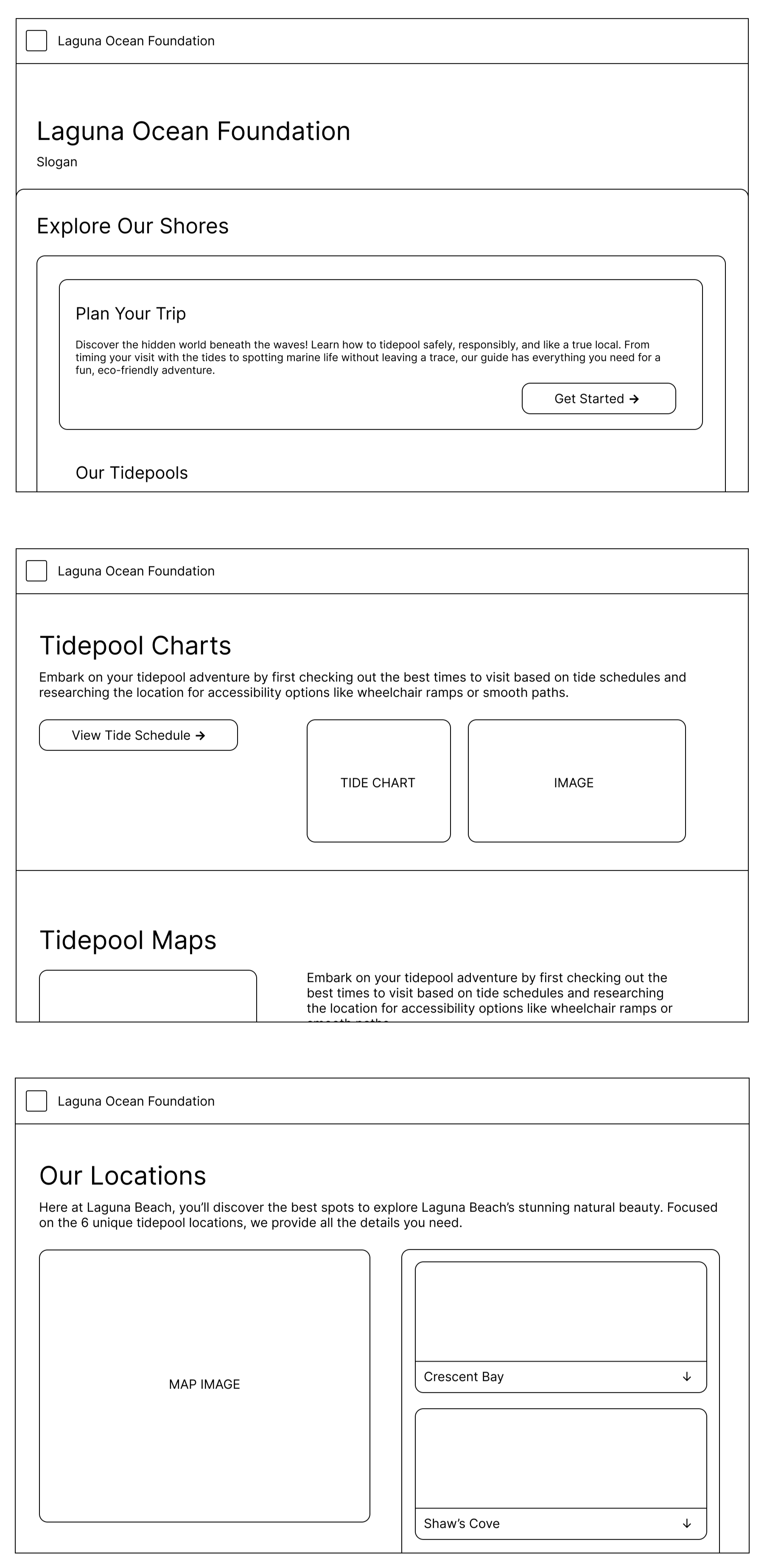
Before:

After:
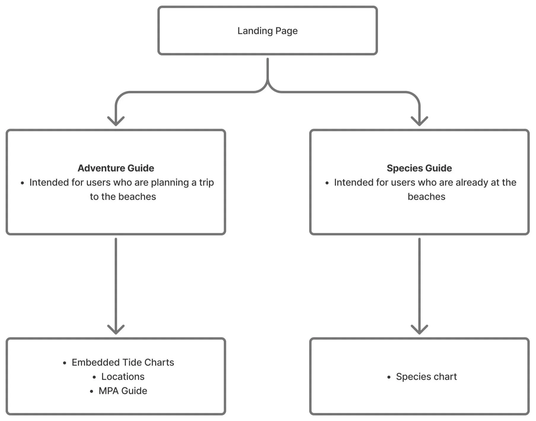
Page Flow of L.O.F
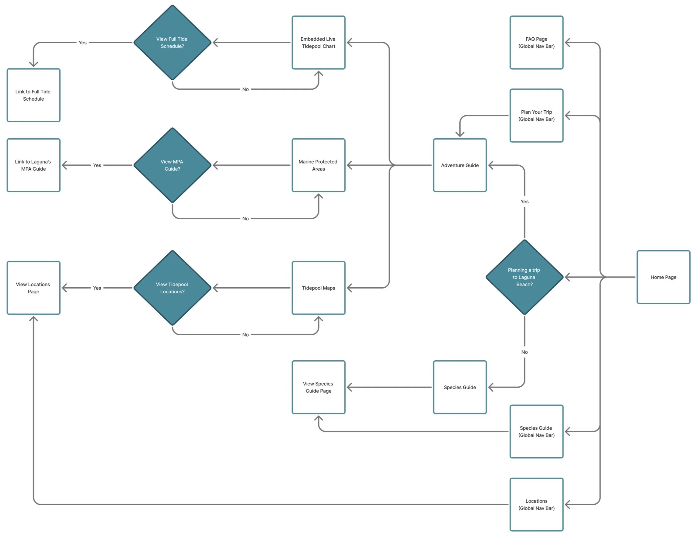
Main User Flows
The page flow follows a clear, branched structure that guides users through key content.
Adventure Guide: Users start by planning a visit, then have the choice to explore tidepool charts, interactive maps, and location tabs to choose where to go. From there, they can access event info, safety tips, and directions.
Species Guide: Users enter through the Species Guide, browse categories or search visually, then click on species cards for more info. The layout prioritizes readability and supports all types of users, from casual explorers to educators!
Summary of Changes
We focused on four key areas:
Design & Accessibility: Ensuring a unified visual style.
Navigation & User Flow: Streamlining the user journey with an improved persona-driven flow.
Interactive Features: Including a responsive map and coordinates.
Content & Layout Improvements: Redesigning the species guide and updating information.
Key Takeaways
Reflections
-
As one of the main developers, I took on a larger portion of the technical workload, which meant navigating real-world friction, like pushing and pulling code.
Managing merge conflicts, syncing changes, and helping my teammates implement features pushed me to improve my communication.
Working with a nonprofit and receiving stakeholder feedback through an intermediary introduced added complexity.
I had to learn how to stay flexible since the project had more swirl and pivots than expected, unclear stakeholder input, shifting requirements, and time constraints.
-
We didn't follow a perfectly linear method, since we started with the existing website as our baseline. This meant we had to rapidly iterate based on stakeholder feedback, user personas, and technical limitations.
I took inspiration from child-friendly platforms like San Diego and Los Angeles Zoo websites as well as National Geographic Kids, which prioritize clarity, color, and intuitive navigation without overwhelming users.
I leaned into my project management strengths to keep design decisions organized and traceable. Each step focused on reducing visual clutter, emphasizing structure, and implementing core UX principles.
Even when the process was chaotic, I tried to keep the user experience clean, balancing aesthetics with practical functionality.
-
This project taught me a lot about refining the user experience, managing tasks, and adapting quickly when goals shifted.
My team contributed to features like the FAQ page and the interactive map design tasks along the way, and together, we responded to feedback with flexibility and focus, ultimately creating a site that’s clear, accessible, and more aligned with real user needs.
This experience sharpened how I prioritize projects through uncertainty, and reminded me that messy processes often lead to the most meaningful outcomes!